TFL Bike Usage

Data Collection
We first the latest data by running a GET request from the London Data Store.
url <- "https://data.london.gov.uk/download/number-bicycle-hires/ac29363e-e0cb-47cc-a97a-e216d900a6b0/tfl-daily-cycle-hires.xlsx"

# Download TFL data to temporary file
httr::GET(url, write_disk(bike.temp <- tempfile(fileext = ".xlsx")))
## Response [https://airdrive-secure.s3-eu-west-1.amazonaws.com/london/dataset/number-bicycle-hires/2020-09-18T09%3A06%3A54/tfl-daily-cycle-hires.xlsx?X-Amz-Algorithm=AWS4-HMAC-SHA256&X-Amz-Credential=AKIAJJDIMAIVZJDICKHA%2F20200920%2Feu-west-1%2Fs3%2Faws4_request&X-Amz-Date=20200920T221706Z&X-Amz-Expires=300&X-Amz-Signature=a58af84450c35e01608ceafac7dcd0c248021fc03b5903c02900b8d02fa43bcb&X-Amz-SignedHeaders=host]
## Date: 2020-09-20 22:17
## Status: 200
## Content-Type: application/vnd.openxmlformats-officedocument.spreadsheetml.sheet
## Size: 165 kB
## <ON DISK> /var/folders/rs/vrxx2x5d1xn8sh9wnyssxfsr0000gn/T//RtmpKP1i7I/file41c8461426fb.xlsx# Use read_excel to read it as dataframe
bike0 <- read_excel(bike.temp,
sheet = "Data",
range = cell_cols("A:B"))Data Wrangling
We then perform some data preprocessing tasks:
- Process dates.
- Select relevant years (2015-2020)
- Changing month columns to numeric.
- Calculate difference between monthly average and 5 year historical average for that month.
#
# Change dates to get year, month, and week
bike <- bike0 %>%
  clean_names() %>%
  rename (bikes_hired = number_of_bicycle_hires) %>%
  mutate (year = year(day),
          month = lubridate::month(day, label = TRUE),
          week = isoweek(day))

# Select only years 2015-2020.
bike_filtered <- bike %>%
                  filter(year %in% c(2015: 2020)) %>%
                  group_by(year, month) %>%
                  summarise(avgMonth=mean(bikes_hired))

bike_monthly_average <- bike_filtered %>%
                  filter(year %in% c(2015: 2019)) %>%
                  group_by(month) %>%
                  summarise(year_avgMonth=mean(avgMonth))

# Change month to numeric
bike_filtered$month <- as.numeric(bike_filtered$month)

# Change month to numeric
bike_monthly_average$month <- as.numeric(bike_monthly_average$month)

# Perform left join
bike_left_join_1 <-left_join(bike_filtered,bike_monthly_average, by="month")

# Calculate difference (diff_month).
bike_left_join_2 <- bike_left_join_1 %>%
  mutate(diff_month = avgMonth-year_avgMonth)

# Print new dataset
bike_left_join_2
## # A tibble: 68 x 5
## # Groups: year [6]
## year month avgMonth year_avgMonth diff_month
## <dbl> <dbl> <dbl> <dbl> <dbl>
## 1 2015 1 18828. 20259. -1431.
## 2 2015 2 19617. 21573. -1956.
## 3 2015 3 22625. 23115. -490.
## 4 2015 4 27951. 28230. -278.
## 5 2015 5 29031. 32422. -3391.
## 6 2015 6 34659. 35262. -604.
## 7 2015 7 36607. 37809. -1202.
## 8 2015 8 33643. 34243. -600.
## 9 2015 9 30114. 32433. -2319.
## 10 2015 10 28560. 29900. -1339.
## # … with 58 more rowsData Visualisation
Following this, we move on to plotting 2 relevant graphs to illustrate the deviation of bike_rentals values from expected values in 2015-2020.
For both of these graphs, we calculate the expected number of rentals per week or per month between 2015-2019 and then, see how each week/month of 2020 compares to the expected rentals.
More specifically, we use the calculation excess_rentals = actual_rentals - expected_rentals. We used means as expected rentals as the data is approximately normally distributed.
Graph 1: Monthly Changes in TFL Bike Rentals
For our first graph, we plot a graph to show how much bike_rentals deviates from the monthly average in 2015-2020.
# Change to numeric
bike_left_join_2$month <- as.numeric(bike_left_join_2$month)
# Change to factor
bike_left_join_2$month <- as.factor(bike_left_join_2$month)

## Plot
ggplot(data=bike_left_join_2, aes(x=month , y=year_avgMonth, group=1)) + facet_wrap(~year) +
labs(x=NULL, y="Bike Rentals", caption="Source: TfL, London Data Store", title="Monthly changes in TfL bike rentals", subtitle= "Change from monthly average shown in blue \nand calculated between 2015-2019") + theme_minimal(base_family="Arial") + theme (plot.title = element_text(size=10), plot.subtitle = element_text(size=9))+
  geom_ribbon(aes(ymin = year_avgMonth + if_else(diff_month < 0, diff_month, 0),
                  ymax = year_avgMonth), color ="grey", fill = "red", alpha = 0.3) +
  geom_ribbon(aes(ymin = year_avgMonth,
                  ymax = year_avgMonth + if_else(diff_month > 0, diff_month, 0)),color ="grey", fill = "green", alpha = 0.3)+ theme(aspect.ratio=0.5) + theme(axis.text.x= element_text(size=5)) +
  scale_x_discrete(labels=c("Jan", "Feb", "Mar", "Apr", "May", "Jun", "Jul", "Aug", "Sep", "Oct", "Nov", "Dec"))+ geom_line(color="blue")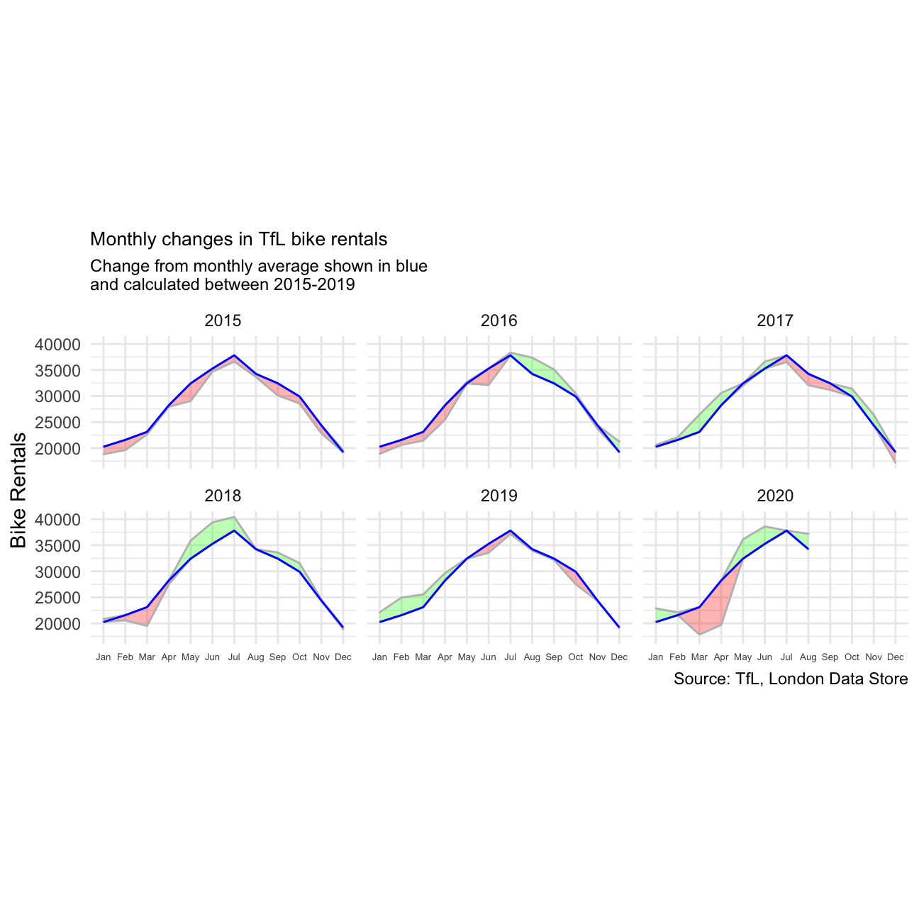
We can see that in 2015 and early 2016, TFL bikes was consistently below the monthly averages. However, this trends starts to reverse from July 2016 as TFL bikes usage starts to outpace the averages.
One interesting area to focus on is the year 2020 when the Covid-19 pandemic hits. TFL bike usage was quick to drop below average in March when case count started rising and the country went into lockdown. However, starting May, positive recovery is seen as usage started to outpace averages again.
Graph 2: Weekly Changes in TFL Bike Rentals
Now we move to plotting a new graph. This second graph looks at percentage changes from the expected level of weekly rentals.
# Filter out, group and calculate mean - Dataset 1
bike_filtered_week <- bike %>%
                  filter(year %in% c(2015: 2020)) %>%
                  group_by(year, week) %>%
                  summarise(avgWeek_filtered_week=mean(bikes_hired))

# Filter out, group and calculate mean - Dataset 2
bike_weekly_average <- bike_filtered_week %>%
                  filter(year %in% c(2015: 2019)) %>%
                  group_by(week) %>%
                  summarise(avgWeek_weekly_average=mean(avgWeek_filtered_week))

# Join Dataset 1 and 2
bike_joined_full <- left_join(bike_filtered_week, bike_weekly_average, by = "week")

# Calculate Excess Rental
bike_joined_full_2 <- bike_joined_full %>%
  mutate(excessrentalspercent = (avgWeek_filtered_week - avgWeek_weekly_average)*100/avgWeek_weekly_average)
Finally, we produce the plots.
ggplot(bike_joined_full_2, aes(x=week, y=excessrentalspercent)) +
  labs(title= "Weekly Changes in TFL Bike Rentals", subtitle=" % changes from weekly averages calculated between 2015-2019", x="week", y=NULL, caption="Source: TfL, London Data Store") +
  facet_wrap(~year)+ geom_line(fill="black") +
  theme_minimal() +
  geom_ribbon(aes(ymin = excessrentalspercent - if_else(excessrentalspercent < 0, excessrentalspercent, 0),
                  ymax = excessrentalspercent), color ="grey", fill = "red", alpha = 0.3) +
  geom_ribbon(aes(ymin = excessrentalspercent,
                  ymax = excessrentalspercent - if_else(excessrentalspercent > 0, excessrentalspercent, 0)),color ="grey", fill = "green", alpha = 0.3) +
   scale_x_discrete(limits = c(13, 26, 39, 53)) +
  geom_rect(xmin=13, xmax=26, ymin=-150, ymax=150, fill="grey", alpha=0.01) +geom_rect(xmin=39, xmax=52,ymin=-150, ymax=150,
                                                                                          fill="grey", alpha=0.01) +
  geom_rug(sides="b", aes(colour=ifelse(excessrentalspercent > 0, "red", "green")), alpha=0.2) +
  theme(legend.position='none') +
  scale_y_continuous(labels = function(x) paste0(x, "%"))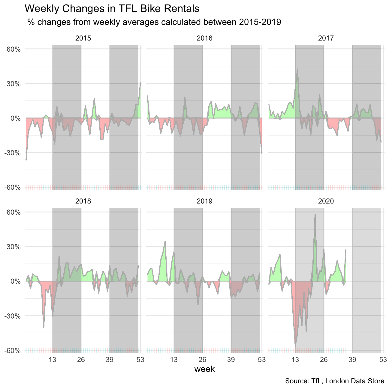
Shifting our lens from the monthly to weekly, we can see some seemily different patterns then when observing only monthly data. For example, not all datapoints in 2015 and early 2016 are below average (red).
This is why it is important to be careful to look at different timelines before drawing conclusions in any analysis.