Brexit Voting Patterns
In this exercise we are trying to recreate a plot examining how political affiliations correlated with how people voted in the 2015 Brexit referendum.
Data Input
First, we load the data into R using read_csv and take a glimpse of the dataset.
# loading brexit_results
brexit_results <- read_csv("brexit_results.csv")

# observe
glimpse(brexit_results)
## Rows: 632
## Columns: 11
## $ Seat <chr> "Aldershot", "Aldridge-Brownhills", "Altrincham and Sale …
## $ con_2015 <dbl> 50.6, 52.0, 53.0, 44.0, 60.8, 22.4, 52.5, 22.1, 50.7, 53.…
## $ lab_2015 <dbl> 18.3, 22.4, 26.7, 34.8, 11.2, 41.0, 18.4, 49.8, 15.1, 21.…
## $ ld_2015 <dbl> 8.82, 3.37, 8.38, 2.98, 7.19, 14.83, 5.98, 2.42, 10.62, 5…
## $ ukip_2015 <dbl> 17.87, 19.62, 8.01, 15.89, 14.44, 21.41, 18.82, 21.76, 19…
## $ leave_share <dbl> 57.9, 67.8, 38.6, 65.3, 49.7, 70.5, 59.9, 61.8, 51.8, 50.…
## $ born_in_uk <dbl> 83.1, 96.1, 90.5, 97.3, 93.3, 97.0, 90.5, 90.7, 87.0, 88.…
## $ male <dbl> 49.9, 48.9, 48.9, 49.2, 48.0, 49.2, 48.5, 49.2, 49.5, 49.…
## $ unemployed <dbl> 3.64, 4.55, 3.04, 4.26, 2.47, 4.74, 3.69, 5.11, 3.39, 2.9…
## $ degree <dbl> 13.87, 9.97, 28.60, 9.34, 18.78, 6.09, 13.12, 7.90, 17.80…
## $ age_18to24 <dbl> 9.41, 7.33, 6.44, 7.75, 5.73, 8.21, 7.82, 8.94, 7.56, 7.6…Cleaning Data
The data does not yet appear in “tidy” format, so we have to tidy the data before continuing.
#bringing the data into "tidy" format
brexit_results_tidy <- brexit_results %>%
  pivot_longer(cols = con_2015:ukip_2015 ,names_to = "political_party", values_to = "election_share")

# observe
glimpse(brexit_results_tidy)
## Rows: 2,528
## Columns: 9
## $ Seat <chr> "Aldershot", "Aldershot", "Aldershot", "Aldershot", "…
## $ leave_share <dbl> 57.9, 57.9, 57.9, 57.9, 67.8, 67.8, 67.8, 67.8, 38.6,…
## $ born_in_uk <dbl> 83.1, 83.1, 83.1, 83.1, 96.1, 96.1, 96.1, 96.1, 90.5,…
## $ male <dbl> 49.9, 49.9, 49.9, 49.9, 48.9, 48.9, 48.9, 48.9, 48.9,…
## $ unemployed <dbl> 3.64, 3.64, 3.64, 3.64, 4.55, 4.55, 4.55, 4.55, 3.04,…
## $ degree <dbl> 13.87, 13.87, 13.87, 13.87, 9.97, 9.97, 9.97, 9.97, 2…
## $ age_18to24 <dbl> 9.41, 9.41, 9.41, 9.41, 7.33, 7.33, 7.33, 7.33, 6.44,…
## $ political_party <chr> "con_2015", "lab_2015", "ld_2015", "ukip_2015", "con_…
## $ election_share <dbl> 50.59, 18.33, 8.82, 17.87, 52.05, 22.37, 3.37, 19.62,…Data Visualisation
Now that the data set is in “tidy” format, we can start to plot our graphs. Speficially, we are interested in plotting Leave % against Party %.
#plotting the graph

vector <- c("#0087dc","#d50000", "#FDBB30", "#EFE600") #this is a vector with party colors

final_plot <- ggplot(brexit_results_tidy) + #using tidy data
geom_point(aes(x=election_share, y=leave_share, group = political_party, color = political_party), #observations grouped by political party, color dependent on political party aswell
             size=1, # adjusting point size
             alpha=0.3) + #adjusting transparency
geom_smooth(aes(x=election_share, y=leave_share, group = political_party, color = political_party), #observations grouped by political party, color dependent on political party as well
              method="lm",
              formula='y~x') +
scale_color_manual(values = vector, #using colors defined above to overwrite standard colors
                     labels = c("Conservative", "Labour", "LibDem", "UKIP")) + #adding lables to groups
theme_bw() +
theme(legend.position = "bottom",
        legend.title=element_blank()) + #formatting legend
  labs(x="Party % in the UK 2015 general election",
       y="Leave % in the 2016 Brexit referendum",
       title="How political affiliation translated to Brexit Voting") #formatting axes wit labs()

final_plot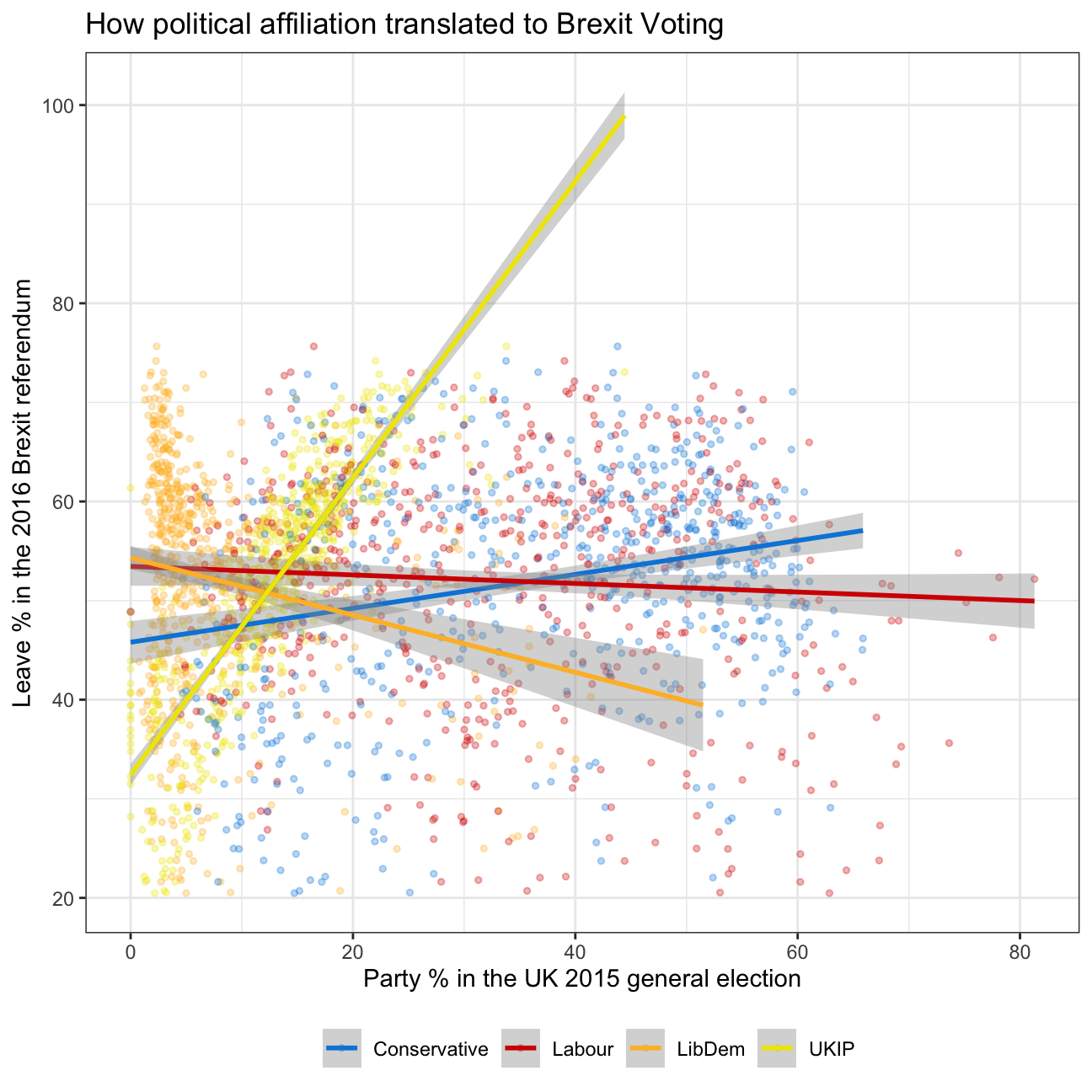
Conclusion
We can see that constituencies that voted heavily for UKIP voted in much larger proportions to leave the EU. This positive correlation was somewhat similar for Conservatives constituencies albeit to a much smaller rate.
On the other hand, in the constituents that voted for LibDem and Labour in the 2015, smaller Leave vote proportion was observed. However, the inverse relationship was much stronger for the LibDem constituencies.